
ParkMate
ParkMate is a new type of parking app that allows users of all lifestyles to effortlessly manage their parking experience. From booking a spot, extending your session, and even paying tickets ParkMate is there every step of the way!
Project Details
Title: ParkMate
Role: Solo UX Designer
Timeline: September 2025 - December 2025
Platform: Mobile App
Tools: Figma, Google Drive
Methods: User Interviews, App Store Analysis, Wireframes, Prototyping, Usability Feedback
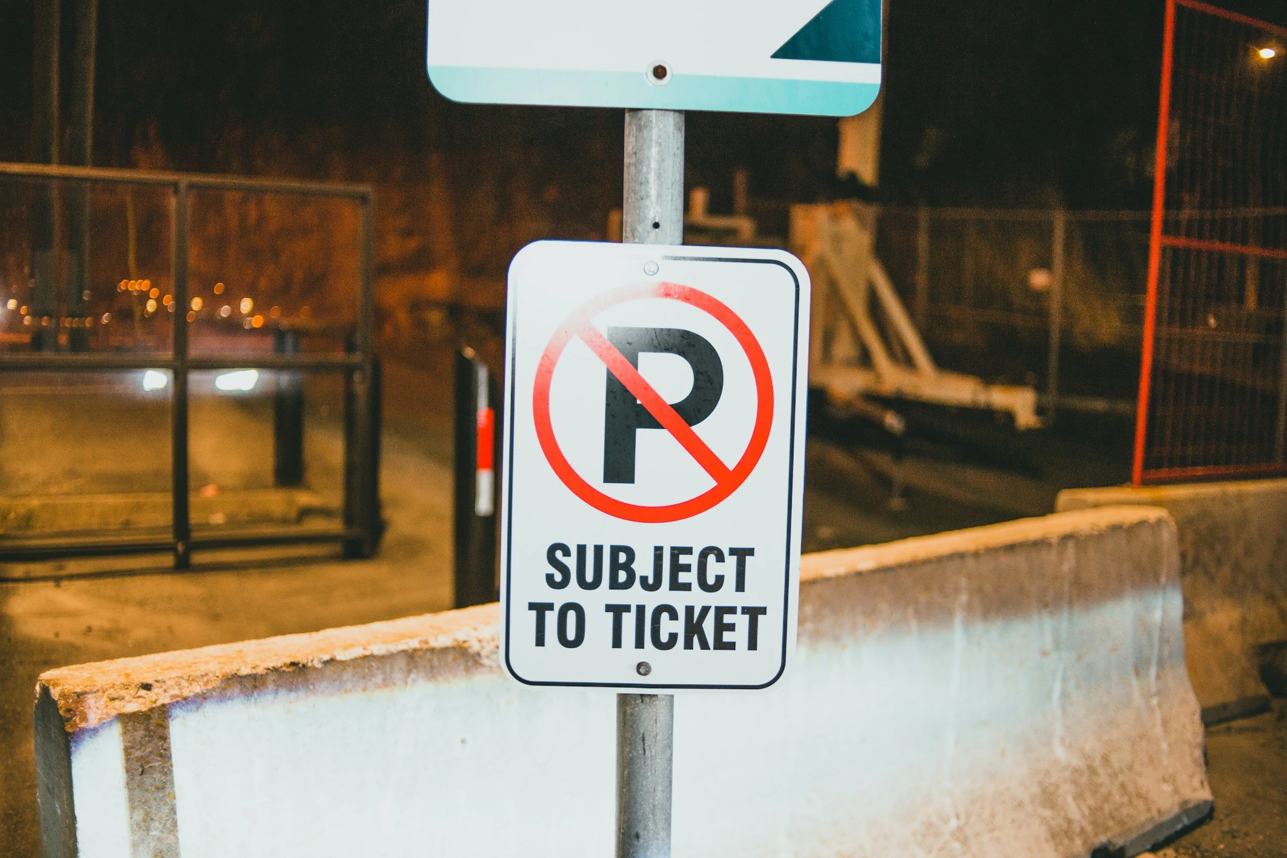
Defining the Problem
To create an effective parking app, I first needed to understand the needs, frustrations, and expectations of real users. I began by interviewing individuals in person to learn directly about their current experiences with parking apps and what was missing. To expand my understanding beyond a small sample, I also analyzed ratings and user comments from the Apple App Store and Samsung Galaxy Store.
Across these sources, the same themes appeared repeatedly—limited app features, outdated functionality, and confusing home layouts. These findings shaped my initial design direction and allowed me to begin developing user personas that brought these insights to life. These personas served as references throughout the project, helping me design with real problems and real motivations in mind.
Our Users
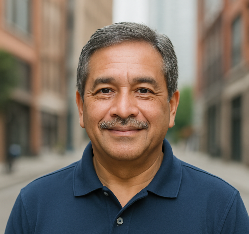
Carlos
A grandfather who wants to take his grandkids into the city, but becomes overwhelmed by all the signs and tow zones.


Elliot
Zareen
A busy university student looking to manage parking tickets efficiently from her phone.
A chef with an everchanging schedule, seeking a way to extend his parking spot without traveling back to his vehicle.
Pain Points
Limited app features
Confusing homepage
Unable to manage tickets
Confusing map features
Lack of notifications
ParkMate's Goals
The main focus of my design was to ensure that app navigation was intuitive and inclusive. The goal of ParkMate was to create a seamless parking experience for all users, regardless of age, lifestyle, tech abilities or accessibility needs.

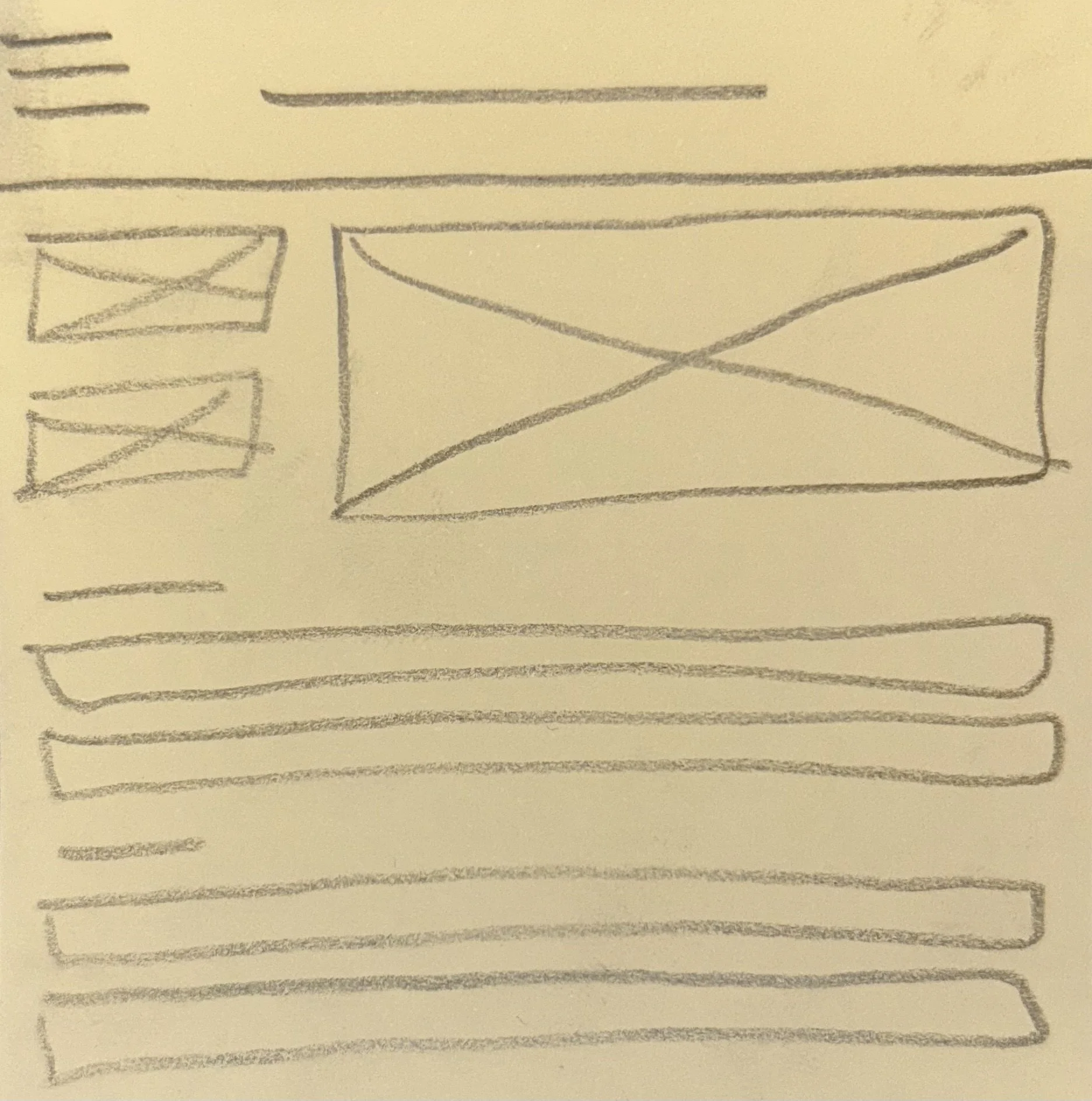
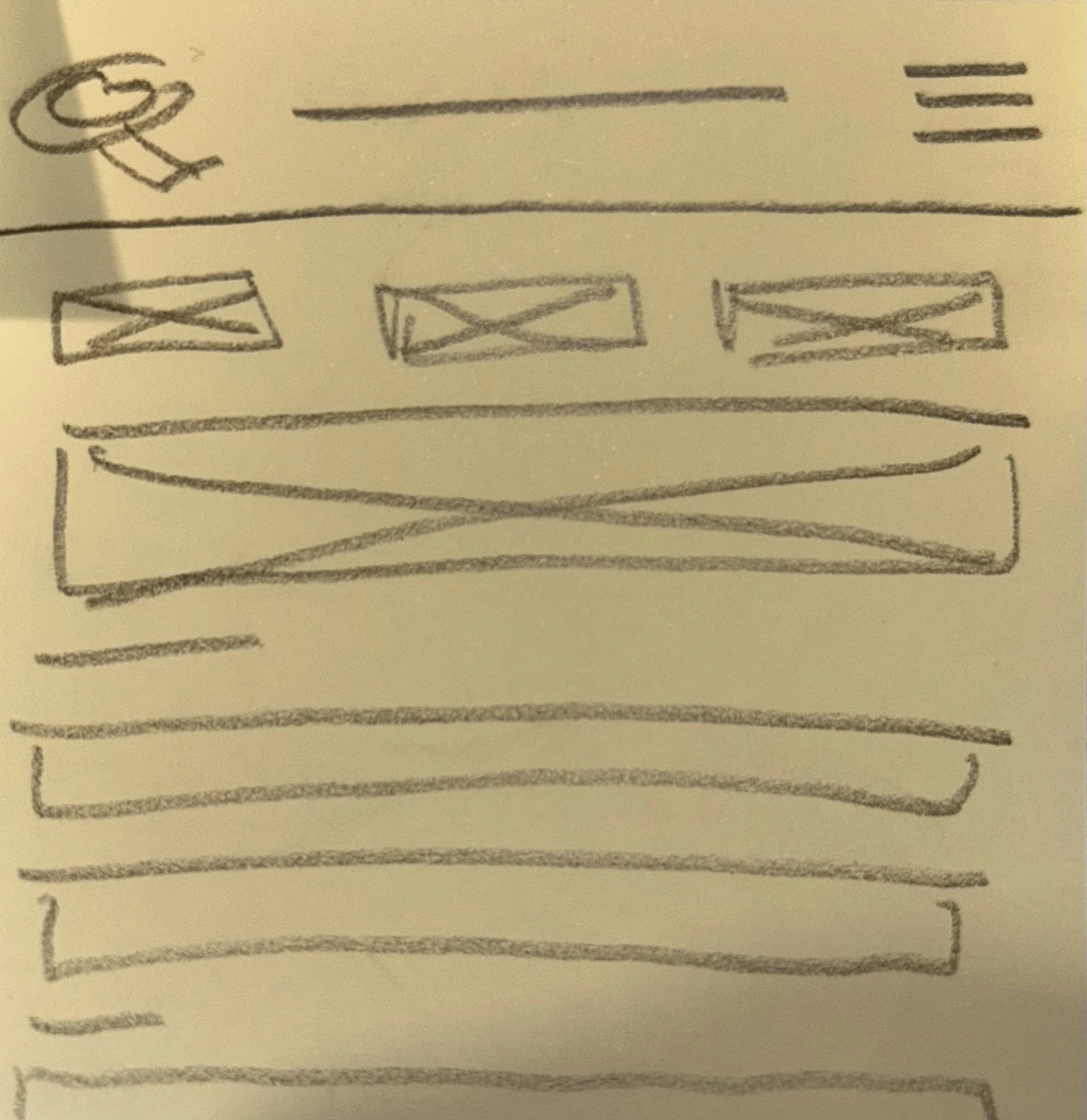
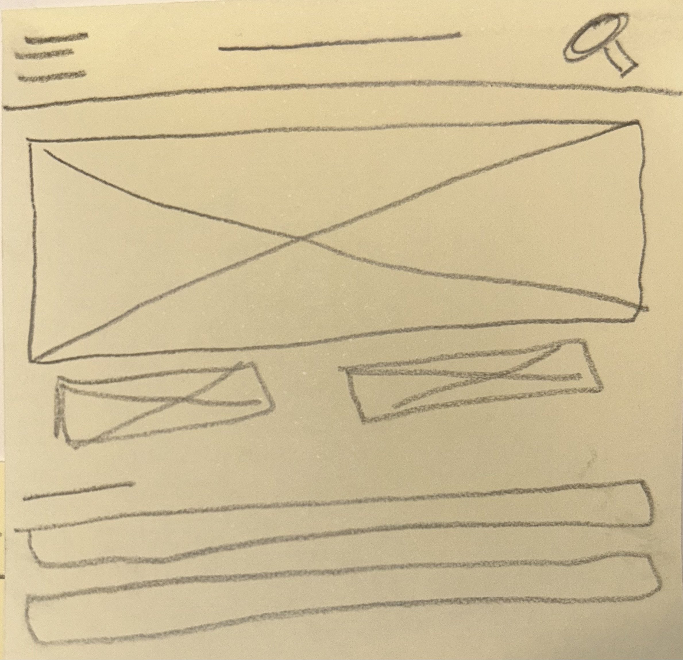
Paper Wireframes
-
![]()
Home page style 1
-
![]()
Home page style 2
-
![]()
Home page style 3
Digital Wireframes
In this user flow, we show how our users can easily navigate the homepage to pay a parking ticket.
1. The user clicks on “Tickets”
2. They then click on “New Ticket”
3. Once prompted to the screen, they can add their information and submit their payment.
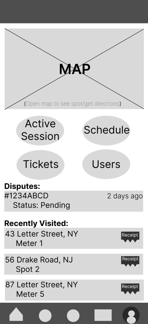
Began to visualize user flow for homepage
Using my paper wireframe as a guide, I started to organize content digitally
Established a layout and structure for the app
Prioritized features or content for users
Ensured that necessary content is prioritized
Iteration and Design Development
Below are some quotes from user testing:
“The navigation bar at the bottom is confusing to use”
“Is that total the new total or what the cost was before extending my session?”
“I wish I could see how much the spot costs per hour as I’m extending my session”
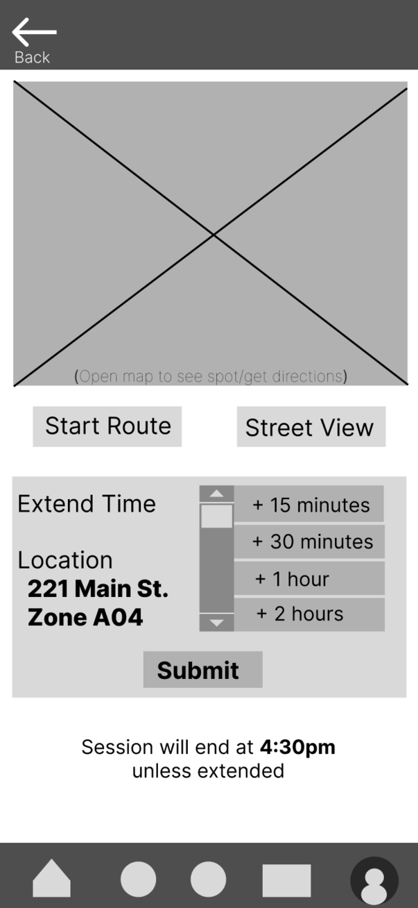
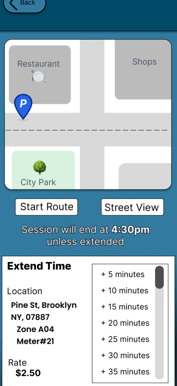
Lo-Fi Prototype
Design alterations:
Removal of navigation bar
Shows users the current rate per hour
Allows users to see their new end time
Implemented colors and highlights to help users navigate the page
Straight-forward map to help users determine location
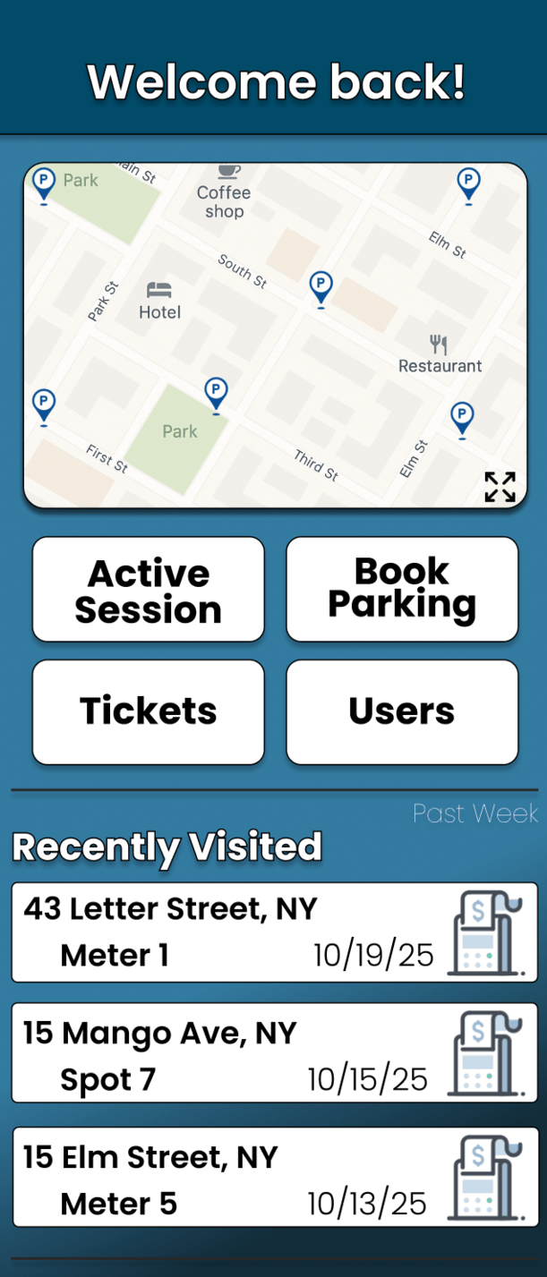
Hi-Fi Prototype
The final design prioritizes clarity, accessibility and user confidence. It simplifies parking tasks into clear steps, helping users manage their experience directly from their phones.
Final Product
Impact & Key Takeaways
Designs’ Impact:
Overall, this experience has been incredibly rewarding. Throughout the process, I developed a deeper understanding of what real users need from a day-to-day mobile app and gained meaningful insight into their frustrations and expectations.
What I learned:
In its current state, this app serves as a comprehensive tool that helps users park, manage their vehicle activity, and stay informed along the way. The design reflects real user feedback and creates a more simplified, accessible, and supportive parking experience.
Next Steps
1.
Add advanced parking filters and real-time alerts.
2.
Expand usability testing with more participants
3.
Continue iterating based on further user feedback